Magazine typesetting
Typography enhances content
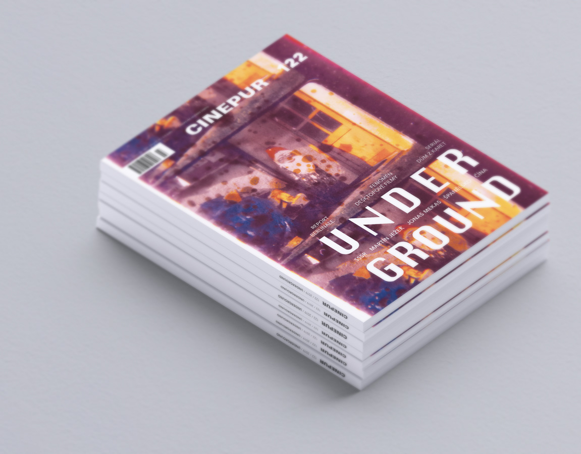
Even a technical topic like construction machinery and data deserves high-quality and interesting typography. For the DigiMessenger magazine for Lectura, I worked with the great visual identity design created by Bloomfield brand studio. Bold headlines, lead paragraphs, structured text, and the use of white space all contributed to better readability and navigation. Every detail has its purpose, and each page has its rhythm, which grabs attention while making reading easier.

