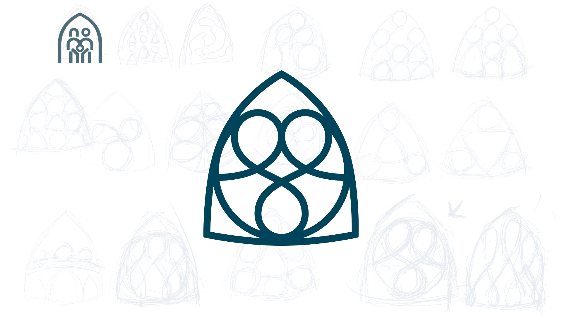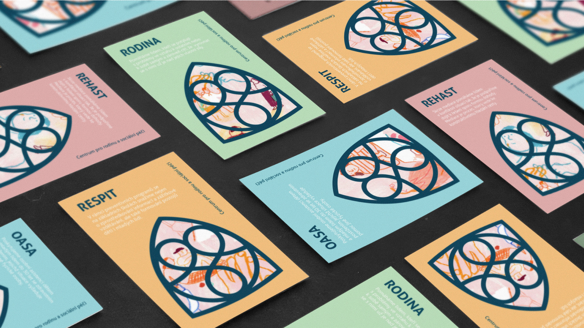
Symbol redesign
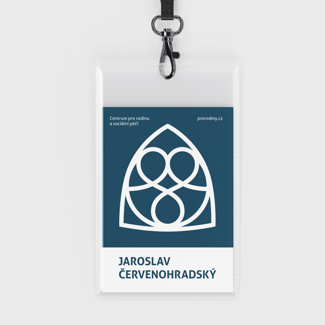
Centrum pro rodinu a sociální péči
The brief was to redesign the existing symbol while preserving its recognisable arch shape. The original mark depicted a family within a Gothic-like window, which had become strongly associated with the organisation over the years.
The new symbol keeps this familiar silhouette but expands its meaning. The central line subtly forms stylised figures — two above and one below — referencing family, community and the relationships between people. It also suggests connection, shared paths and continuous support.
The arch and circular forms symbolise protection and safety, while the smooth geometry gives the symbol a calm and approachable character. And for those who take a closer look, there is a hidden heart within the composition.