on the waves of wine
Vlnka Winery
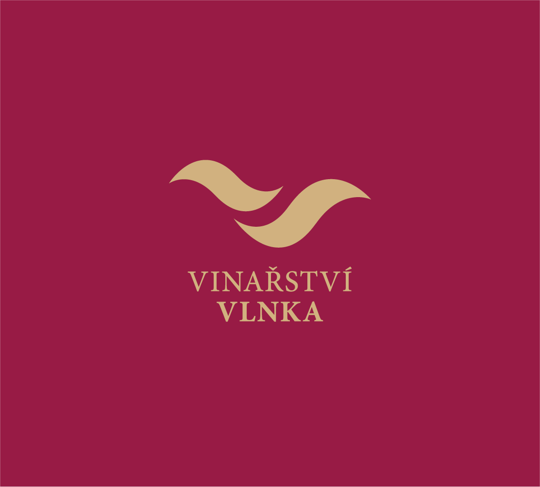
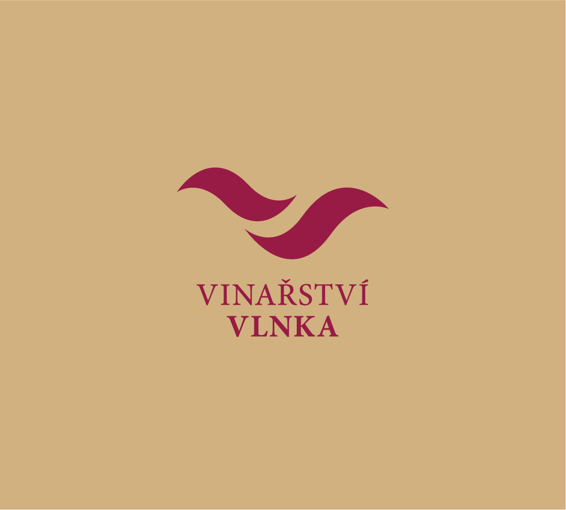
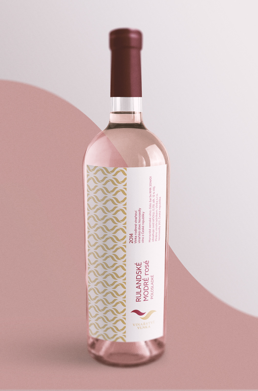
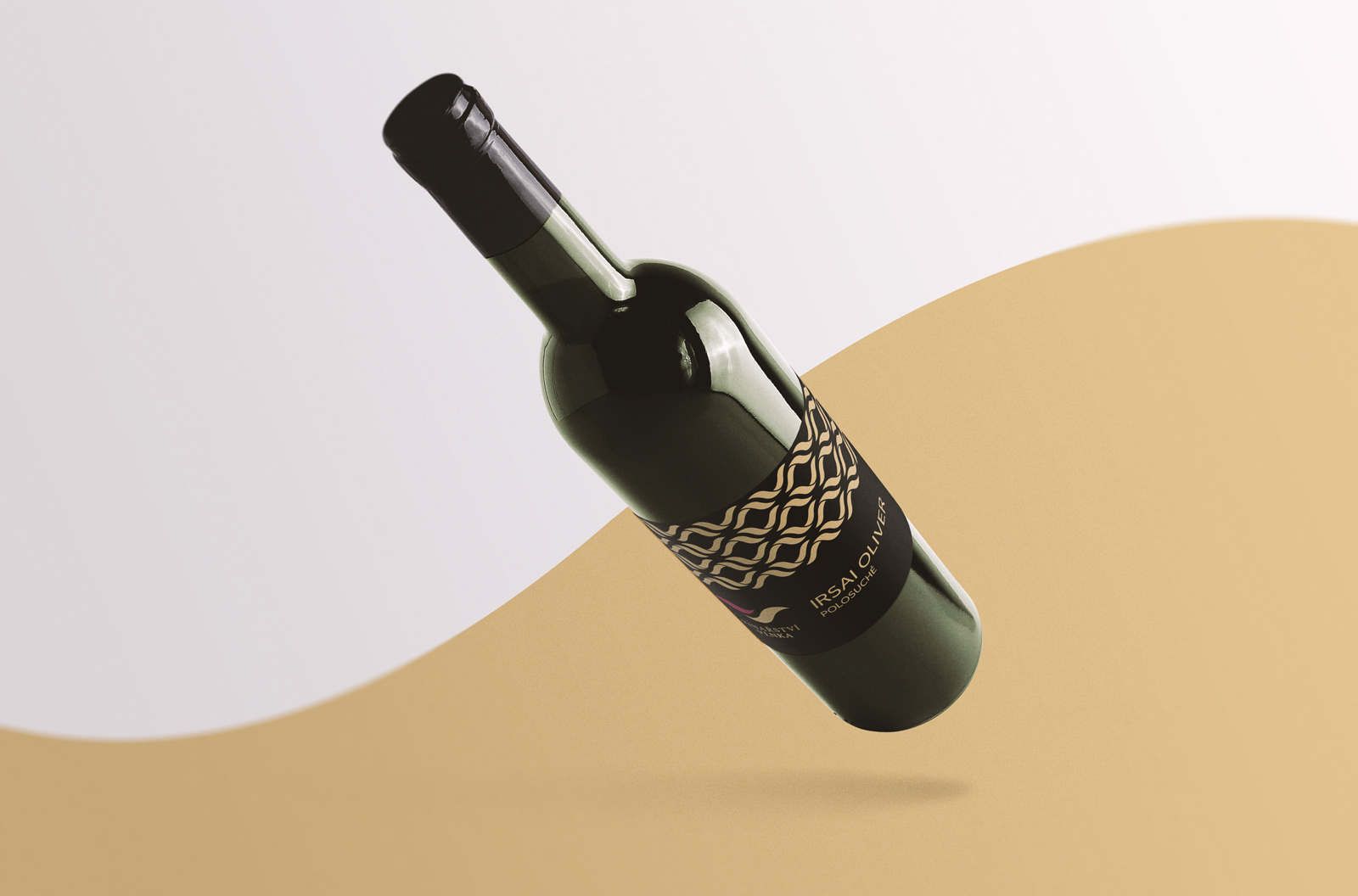
Mr. Vlnka and his son have a beautiful surname. So convenient for their profession. It was lovely to design a logo for their family winery. "Vlnka" is the Czech word for "wavelet". The logotype consists of two wavelets — the father and the son. They form together another wave in the shape of letter "V" and the colors refer to red and white wine. The family tradition of winery dates back to 1972. Therefore, a more classic style of serif font was chosen. The text on the vignettes, on the other hand, is written in modern sans-serif typeface, as a connection between the old and the new. — And of course, why not use wavelets to create significant patterns that catch your eye.
